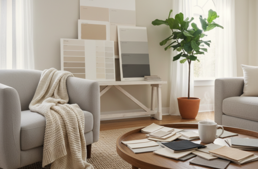
Small color shifts can change how a home feels. By choosing a clear palette, residents can make tight living spaces seem more open and orderly. Designers often point to cohesive schemes as the base for a tidy, welcoming room.
Light-reflecting surfaces and soft hues help maximize limited square footage. These selections also let furniture and textiles stand out without cluttering the view.
When people pick the right colors and decor, the result is a space that looks cleaner and feels calm. Versatile items keep the room timeless and easy to update with trends or seasonal touches.
In short: a thoughtful palette and a few reflective finishes offer a big visual impact. They help transform a small place into a comfortable, organized retreat.
The Appeal of Bright Neutral Apartment Ideas
A well-chosen palette can instantly change how a living room feels and functions. Simple color moves guide the eye, making a room read as cleaner and more organized.
The Psychology of Light
Light shapes mood and scale. Lighter hues reflect daylight, so a living room looks larger and calmer. Farrow & Ball names like Drop Cloth, Stirabout, and Old White show how subtle paint choices alter perception.
Choosing a gentle neutral color can lift the mood and make rooms feel airy without changing furniture or layout.
Versatility in Small Spaces
Neutral living rooms give homeowners a flexible design base. Soft shades keep the look timeless and let textiles or art take center stage.
- Neutral living acts as a canvas for seasonal decor and small updates.
- Layering various shades prevents a flat look during the day.
- Professional paint finishes enhance architectural details for a polished result.
Establishing a Creamy Foundation
A creamy foundation makes it simple to layer texture and silhouette without crowding a living area. In a New York project, designer Chad Dorsey applied a cream palette to walls, furniture, and accessories to create calm continuity.
The result reads as one cohesive home rather than a collection of parts. This approach gives permission to mix furniture silhouettes and to add playful accents like a feathery print sofa without overwhelming the room.
To keep the neutral living scheme from feeling flat, layer fabrics and finishes. Vary rug weaves, curtain weight, and throw textures. Add matte and silk paint sheens for subtle contrast.
“A unified palette lets unique pieces shine while the overall design stays calm.”
- Start with soft shades on walls and large furniture pieces.
- Introduce texture to maintain warmth over time.
- Choose complementary colors and small-scale patterns for focal points.
Playing with Taupe Tones
A spectrum of taupe tones lets designers craft depth and calm in even the smallest rooms.
Designer Eva Bradley proved this in a classic San Francisco Victorian living room. She layered taupe shades across walls, upholstery, and trim to create a cohesive neutral home that still feels intentional.
Adding a Mario Bellini sofa and ombré striped curtains introduces gentle pattern and contrast without overwhelming the light. A well-placed coffee table and rug then anchor the living area for daily living and for guests.
Quality matters: premium paint and carefully chosen furniture in varied shades keep the look timeless as styles change over time.
“When you play with a spectrum of neutrals, you create a sophisticated look that feels light and airy throughout the apartment.”
- Layer tones to avoid a flat look.
- Use texture on a sofa, rug, and throws to add warmth.
- Let a coffee table serve both form and function as a focal point.
Incorporating Sun-Kissed Metallics
Warm metals can introduce a sunlit glow that changes how a living room reads at different times of day.
Small metallic touches lift a base palette and make surfaces feel more considered. The design firm Redd Kaihoi used bronze, brass, and gilt wood to warm an Upper East Side living room and add a refined layer of texture.
Choosing Bronze and Brass Accents
Bronze and brass act as subtle focal points. They reflect light and amplify a soft color scheme without overwhelming the room.
- Redd Kaihoi’s bronze and brass accents added a sun‑kissed glow to the living room.
- Metallic shades help reflect light and make living rooms feel more luxurious and intentional.
- Pairing brass with wood balances warmth and keeps the look grounded.
- These accents serve as a gentle color inflection point for rooms on a tight budget.
- Designers recommend warm metals to easily elevate existing neutrals.
Used sparingly, these finishes refresh a living space and hold up as style shifts over time.
Utilizing Scenic Wall Murals
Installing a wall mural changes a room’s focal point and gives a home an unexpected sense of scale.
The late design legend Suzanne Rheinstein transformed her New York apartment with a hand-painted scenic mural that reads like a bucolic oasis. Her approach shows how artful treatments can shift the feel of a small living area.
A mural breaks up plain walls and creates a single, strong focal point for the living room. It brings nature into the space and adds depth that tricks the eye into seeing a larger room.
- Use a mural to anchor seating and define a living zone.
- Pick a scale and palette that complements existing furniture and decor.
- Consider a hand-painted scene for a one-of-a-kind effect.
“A well-chosen mural makes a compact room feel expansive and uniquely personal.”
Artful wall treatments elevate the design and ensure the space reflects individual taste while creating a calm, memorable living environment.
Expanding the Definition of Neutral
Mixing warm beiges with muted greens gives living spaces a fresh, lived-in quality. Andre Herrero of Charlap Hyman & Herrero applied this in a California residence, pairing beige, white, olive green, and stainless steel to broaden a simple palette.
This approach shifts how a room reads without drastic changes. Adding an unexpected tone like olive softens the contrast between furniture and walls. It also makes the space feel curated and modern.
By using a wider range of tones and shades, designers create more dynamic living rooms. Different textures and metal finishes help tie the scheme together.
- Mix warm beiges with an olive accent to lift a room.
- Use stainless steel sparingly to add cool contrast.
- Layer textiles so each room feels cohesive and personal.
“Expanding what counts as a neutral lets a home reflect individual taste across rooms.”
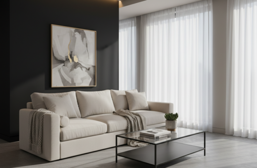
Creating Contrast with Black Accents
A single dark detail can turn a simple room into a deliberate design statement. Designer Alfredo Paredes covered a chimney breast in jet black Venetian plaster at a Vermont alpine retreat to create a striking focal point.
Black set against white walls makes a living room read as bold and precise. The contrast gives depth to the palette and helps furniture and textiles stand out.
In a neutral living scheme, a dark fireplace can anchor the space. It balances lighter pieces and lends a refined, cozy tone to the home.
- Use black accents sparingly to avoid overpowering smaller rooms.
- Pair a dark wall or chimney with lighter upholstery to keep the living area airy.
- Let a fireplace act as an intentional design exclamation in living rooms and house entries.
“A well-chosen black detail gives a room the depth it needs to feel complete.”
Embracing Moody Charcoal Shades
A wash of deep ash across ceilings and walls gives a living room a cinematic, composed feel. Designer Jeremiah Brent used an ash paint across walls, ceilings, and window treatments in his New York office lounge to create that enigmatic luxe.
Embracing charcoal shades on your walls and ceilings can make a room feel intimate, cozy, and sophisticated for any home. Pairing a bold marble fireplace and black velvet armchairs provides striking accents to complete the look.
Prospective buyers often notice the depth that moody paint brings to a house. In a compact apartment, a single dark color can visually expand the living space by creating a seamless backdrop for furnishings.
“A single shade can make a room feel modern and timeless.”
Tip: dousing a living area in one shade simplifies styling. The result is a dramatic, timeless room that reads as thoughtful and polished.
Mixing Antique and Modern Furniture
Blending antique finds and contemporary silhouettes helps a living room read as collected and purposeful. Designer Alyssa Kapito layered soft whites to shape a serene New York home where era-mixing feels natural.
A plaster chandelier by Eric Schmitt adds architectural interest and a warm glow to the all-white living space. It gives the room a focal point without heavy color or clutter.
Mixing furniture from different periods makes rooms feel lived-in. A carved side chair beside a modern sofa creates contrast that highlights each piece.
- Keep white walls as a unifying palette so varied pieces work together.
- Choose a durable rug and a low coffee table to ground the layout and guide traffic flow.
- Introduce varied textures—linen, patinaed wood, and plaster—so the room reads layered and warm.
“A collection of eras makes a home feel personal rather than staged.”
Leveraging Natural Materials
Natural finishes bring a calm, grounded quality to living spaces. Using honest materials shifts the look of a living room without heavy color or busy pattern. Designer Nicole Hollis embraced this idea in a desert retreat, pairing travertine, bleached oak, and limestone to reflect the landscape.
Bleached Oak Finishes
Bleached oak keeps wood light and modern. Use it on floors, a low table, or on simple shelving to maintain a soft look when heavier stone appears in the room.
Bleached wood helps the walls and furniture read cohesive. It also provides an enduring base for neutral living schemes and layered textiles.
Travertine and Limestone
Stone surfaces add texture and cool tones that balance warm wood. Travertine and limestone work well as fireplace surrounds, floors, or a statement table top.
- Nicole Hollis used these materials to mirror the desert outside.
- Wood and stone together create lasting warmth and calm.
- A living room with natural tones will age well and feel timeless.
“Natural materials give a home a measured, lasting warmth.”
Layering All-White Interiors
An all-white scheme relies on material contrasts more than color to read as rich and considered. Augusta Hoffman proved this by pairing contemporary silhouettes with weightier wood antiques to refine a living room.
Layering all-white interiors asks for a careful mix of textiles, finishes, and scale so the room feels open rather than sterile.
Embracing the materiality of wood introduces contrast that gives the space depth. Choose dark pieces with care so they anchor but do not dominate the walls or seating.
- Balance one or two heavier antiques with simpler, modern seating to achieve a thoughtful mix.
- Use varied textiles—linen, boucle, and a low-pile rug—to keep the living area tactile and inviting.
- Let generous negative space around furniture reinforce a calm, functional room layout.
“A well-layered living room offers a clean, sophisticated backdrop for daily living.”
For practical tips on working with whites and tones, see decorating with neutrals.
Adding Texture with Lime Wash
With lime wash, a wall becomes a soft, cave-like surface that wraps the living room in warmth.
The Office of Tangible Space used lime wash in a Brooklyn apartment to create an acorn-like, cavelike feeling across the room. This finish reads as handcrafted and gives flat walls gentle variation in texture.
Rather than plain paint, lime wash adds depth and a subtle patina. It pairs well with a scalloped wicker ottoman and a low-pile rug to layer tactile interest.
- A well-placed sofa and coffee table define the living zone and keep the space functional.
- Use a rustic table or woven ottoman to amplify warmth and livability.
- These subtle finishes build a sophisticated neutral living environment that feels modern and inviting.
“Lime wash turns ordinary walls into a quiet backdrop that makes furniture and textiles feel more intentional.”
For application tips and historic context, consult this concise limewash paint guide.
Balancing Dark Wood Elements
Dark timber details ground a living room but must be balanced to avoid weighing down the whole space.
Designer Kristen Buckingham applied this idea at Reese Witherspoon’s Ojai ranch by pairing linen slipcovers with warm wood furniture. The linen softens heavy silhouettes and keeps the room feeling youthful and lived in.
Introduce a stone fireplace to anchor the hearth while spreading lighter tones across textiles and walls. A well-chosen table acts as a central piece, helping to mix different wood tones across the living space for visual harmony.
Focus on tone and texture: matte finishes, a soft rug, and unvarnished wood pieces create depth without clutter.
- Use slipcovers or light upholstery to offset heavy wood furniture.
- Place a single dark piece near lighter elements to balance contrast.
- Choose a table that ties varied wood tones together across the house.
“A careful mix of wood and linen keeps a room sophisticated and welcoming.”
Integrating Subtle Patterns
Soft geometric or tone-on-tone patterns bring depth to a sofa and help the living room feel curated. Architect Paul Lamb’s Austin ranch shows this well: modern sofa and chairs sit against traditional adobe walls, and faint motifs tie the two together.
Subtle patterns add personality without loud shifts in color. Choose prints in complementary tones so furniture and accents read as one calm composition.
Textiles—throw pillows, a low‑pile rug, or a woven blanket—are ideal places to introduce pattern. Keep scale small so pieces don’t compete with architecture.
Designers recommend quality furniture first, then thoughtful accents. That order keeps a living space feeling intentional and professionally edited.
“Small, considered patterns give rooms depth and let unique pieces stand out.”
- Layer tone-on-tone prints for cohesion.
- Limit pattern scale near strong architectural elements like adobe walls.
- Use accents sparingly to preserve a calm, lived-in look.
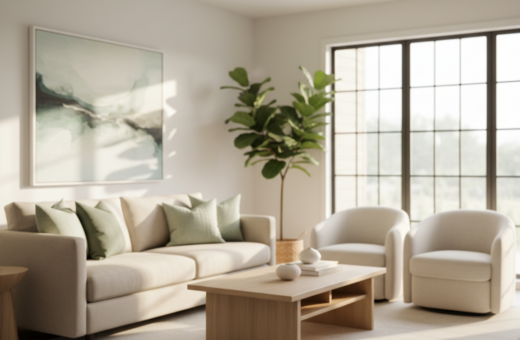
Introducing Organic Pops of Color
Introducing small, organic color notes can refresh a living room without upending the whole palette. Designers often select one or two natural hues to punctuate white walls and simple furniture. This keeps the overall neutral palette intact while adding a clear focal point.
Ken Fulk reintroduced history with a 19th-century stone mantel that brings old-world texture and a warm stone presence to a Sonoma home. Tim Godbold balanced a stone fireplace with a deep blue carpet to ground the area and tie the room to the rest of the house.
Rodney Lawrence used a sunrise-like gradient wallpaper to create a calm, organic look in a Manhattan model unit. Ashe Leandro added a curvaceous olive-green sofa to give a neutral living space a single, confident color note without cluttering the layout.
Small accents—an oak coffee table, a linen throw, or a low-slung table lamp—add texture and keep rooms feeling intentional. Use these touches sparingly so light and tones remain the main focus of the room.
“Introducing organic pops of color and texture helps your apartment feel vibrant while maintaining a clean and bright aesthetic.”
- Keep one dominant accent for cohesion.
- Let wood and stone anchor the neutral home.
- Layer textures—linen, wool, and low-pile rugs—for lasting depth.
Conclusion
A few deliberate choices in color, texture, and material transform a small home into a restful, functional place. Focus on a simple foundation and layer wood, stone, linen, and soft finishes to build depth without clutter.
These principles suit a city apartment or a country house. They make rooms feel larger, more ordered, and genuinely lived in.
Take time to edit and curate. Swap one or two accents seasonally and let a single, thoughtful piece anchor each room.
Enjoy the process—sit down with a cup of coffee and appreciate the calm your choices have created.