They spent months testing how a single shade can shift mood and scale in a living space. The writer applied simple techniques to observe light, texture, and finish. This hands-on work revealed practical rules anyone can use to refine a room.
By sampling paint on several walls and watching changes through the day, they learned which tones support natural light and which fight it. The process taught a clear lesson: the right choice raises a space from ordinary to polished.
This short guide captures those lessons and shows how small adjustments lead to a cohesive, stylish result. It focuses on realistic steps and avoids trends that fade. Readers in the United States will find the tips easy to apply and to adapt for different layouts.
Understanding the Role of Neutrals in Interior Design
The right muted tones act like a canvas, letting architectural details and textiles become the focus.
Benjamin Moore offers a wide selection of timeless neutral paint colors that suit any style or era. Designers praise how these shades bring calm and cohesion to an interior, from a living room to a bathroom.
Neutrals, including warm beiges and soft grays, deliver soothing effects that help a space feel steady and refined. Choosing the proper neutral paint anchors a room so furnishings and art read as intentional rather than accidental.
“A neutral base gives flexibility; decor can evolve without repainting.”
- Benjammin Moore favorites like Manchester Tan HC-81 and Revere Pewter HC-172 work across eras.
- Using varied neutrals lets the palette shift with new textiles and finishes.
- Experts note that a thoughtful base creates a cohesive, professionally curated interior.
Conducting a Comprehensive Neutral Home Color Comparison
She mapped Light Reflective Value across rooms to see which paint choices lifted a small space and which flattened it. This step is the backbone of any neutral home color comparison and clarifies how finishes act in real life.
Analyzing LRV Values
LRV shows how much light a paint will reflect. He recorded LRV readings for test panels and noted how a single hue brightened a north-facing room but read flat in a shaded hall.
Comparing Color Families
Benjamin Moore data was central to the process. He compared swatches like Pashmina AF-100 and Antique Pewter 1560 to judge how beige, gray, and taupe undertones behaved near wood floors and fabrics.
“Every neutral hue has a subtle undertone that can shift dramatically with the quality of light.”
- Practical tip: Place samples on multiple walls and view at morning and evening.
- Look for how a paint color complements furniture finishes before committing.
- Use Benjamin Moore charts to match LRV and hue data for confident selection.
The Impact of Natural Light on Paint Selection
Daylight alters the way any paint reads, so the same sample can feel bright at noon and muted by dusk. Observing a swatch across the day helps reveal undertones and true warmth.
Adjusting for room orientation matters. Sherwin-Williams advises checking whether rooms face east, west, north, or south before picking a final shade. East-facing rooms warm up in morning light, while north-facing spaces stay cool and need softer, warmer options.
Practical checks
- Natural light changes throughout the day, so a paint used in a bedroom or kitchen will look different at various times.
- Light Reflective Value (LRV) measures how much light a paint will return to a space; higher LRV brightens darker rooms.
- Choosing white for a kitchen requires testing—some whites read blue or yellow under certain lighting.
Tip: Match LRV to the room’s exposure and revisit swatches at morning and evening. This approach keeps the final choice consistent and inviting across seasons and lighting conditions.
Selecting Warm Neutrals for North Facing Rooms
North-facing rooms often feel cool and muted, so choosing warmer paint tones brings an instant sense of welcome. This approach counters the blue cast that can make a space seem distant and small.
Practical picks matter. Sherwin-Williams suggests shades like Rivers Edge SW 7517 and Drift of Mist SW 9166 to brighten rooms with limited light.
When she tested options, Benjamin Moore samples with warm undertones proved most effective. A warm gray or taupe can add depth without overpowering furnishings.
Design tip: choose a beige or warm gray as a base, then layer textiles and wood tones to amplify warmth. This method makes the room feel larger and cozier at once.
“Using neutral paint colors with warm undertones is a professional strategy to ensure your rooms feel welcoming in every light.”
- Select a final paint color after viewing swatches in morning and evening light.
- Favor Benjamin Moore formulas with noted warm undertones for consistent results.
- Balance with warm textiles and finishes to avoid a flat, lifeless shade.
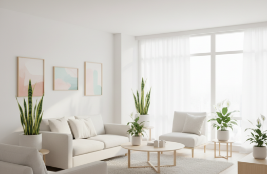
Brightening Spaces with Crisp Neutral Hues
A crisp, cool palette can instantly open a cramped space and let architectural details breathe.
For a clean, airy look in a small kitchen or guest bedroom, aim for paints with an LRV between 50 and 60. Sherwin-Williams recommends shades that reflect light without feeling stark.
- Grayish SW 6001 and Front Porch SW 7651 brighten rooms while keeping a soft, inviting feel.
- Using a crisp white or light gray paint makes a small room feel larger and more open.
- These colors work well across varied light conditions, giving a versatile foundation for design.
Practical point: test swatches in both morning and evening light to confirm how the hues read on your walls.
“A restrained, luminous treatment brings clarity to a space and keeps the overall look modern and balanced.”
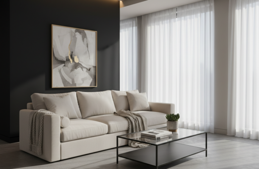
Incorporating Dark Shades for Dramatic Depth
Introducing deep tones can carve out dramatic focal points and make a room feel intentionally layered. Dark hues add depth when used with care and a clear plan.
Using Dark Neutrals on Cabinets
Dark neutrals on cabinetry create instant contrast. She painted her kitchen cabinets in a deep gray to anchor bright walls and light finishes.
Design note: Iron Ore SW 7069 or Attitude Gray SW 7060 read bold but stay refined when paired with white trim.
Exterior Paint Considerations
For exteriors, Sherwin-Williams notes that deep neutral paint colors perform best where they catch plenty of light.
- Tip: Check how a paint color looks at noon and dusk before committing.
- Balance: Use white elements to frame the dark shade so the depth feels intentional.
- Options: Benjamin Moore’s Hale Navy HC-154 offers a dramatic, sophisticated alternative for both exterior and interior use.
“When placed thoughtfully, dark shades transform a space without overwhelming it.”
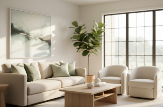
Exploring the Versatility of Beige and Taupe
Beige and taupe act like adaptable backdrops that quietly change personality as furnishings and light vary. These classic hues give a room warmth and a subtle depth that works with many palettes.
Practical note: a warm gray or taupe on the walls often reads differently by time of day. It can make fabrics pop, soften wood tones, and create gentle contrast with crisp whites on trim.
- Beige and taupe provide an inviting base for layering decor and furniture.
- Using a warm gray or taupe can create a chameleon-like effect that adapts to surrounding colors.
- Benjamin Moore picks such as Manchester Tan HC-81 give warmth and purposeful contrast against white trim.
- Mixing multiple whites and warm neutrals yields a curated, enduring style across rooms.
“These versatile hues have stood the test of time, ensuring design choices remain relevant and stylish.”
Why Creamy Whites Outperform Clinical Tones
Creamy whites soften a room’s edges and add a subtle warmth that stark whites rarely achieve. These softer whites give a space gentle depth and prevent interiors from feeling cold or sterile.
In rooms flooded with natural light, a creamy white often reads more comfortable than a blinding bright white. It reduces glare and preserves the visual texture of millwork and textiles.
She found that switching to a warm white in her office changed how the room felt. The softer whites made the area more welcoming and kept details like trim and built-ins from disappearing.
Practical note: choose the right amount of pigment. A touch of warmth adds depth without making a space look dingy.
- Warmth and depth: creamy whites prevent a room from feeling clinical.
- Better in bright rooms: they tame glare in spaces with strong natural light.
- Architectural clarity: these whites highlight trim and features without overwhelming the design.
The Importance of Undertones in Cohesive Palettes
Undertones act like an invisible thread, tying fabrics, trim, and paint into a single look. She found that a subtle beige or warm gray can shift mood simply by the undertone it carries.
Understanding undertones is the secret to creating a cohesive palette. Benjamin Moore experts suggest matching undertones to avoid clashes across rooms.
Whether a hue leans yellow, pink, blue, or green determines how it pairs with wood, textiles, and metal finishes. Consistency of undertone creates a professional, intentional interior.
- Match warm undertones when you want unity across adjacent rooms.
- Choose cooler hints of blue or green for a calm, modern feel.
- Test a neutral paint colors sample next to fabrics to see true interaction.
- Benjamin Moore’s palette makes it easier to compare undertone families.
“Even tiny undertone shifts dictate how a shade reads across light and material.”
Essential Tips for Professional Paint Application
“A flawless finish begins long before the roller touches the wall;” careful prep and the right products make the difference between a quick job and a lasting result.
Surface Preparation
Start by cleaning and repairing surfaces. Fill cracks, sand glossy spots, and skim coat where needed for a level-five finish.
Pro tip: primer matters—use a bonding primer on patched plaster and kitchen cabinets to ensure adhesion and durability.
Achieving Smooth Finishes
Use high-quality rollers and brushes and apply paint in thin, even coats. Keep a consistent wet edge to avoid lap marks and texture differences.
Allow proper drying time between coats. The correct amount of paint per coat helps hide imperfections and reveals true undertones.
Color Drenching Techniques
Color drenching—painting walls, trim, and even cabinets the same hue—creates a modern, immersive space. It simplifies contrast and lets a gray or white palette read as one cohesive interior.
When done well, drenching amplifies architectural lines and makes small rooms feel intentional. She primed kitchen cabinets and then applied final coats with thin layers for a durable, professional finish.
“Proper preparation lets the chosen paint color sing and keeps finishes looking intentional for years.”
- Skim coat to remove texture irregularities.
- Prime patched areas and cabinetry before top coats.
- Use quality tools and the right amount of paint for even coverage.
- Test swatches on walls to confirm undertones and final contrast.
Why Swatch Testing is Non-Negotiable
Small swatches reveal big surprises: a single paint sample can shift from warm to cool once it’s on the wall. She always tests samples on multiple walls and watches them at different times of the day.
- Real lighting matters: natural light and artificial lighting change how a paint reads in a room.
- Test large swatches so the paint color and gray balance show true undertone and texture.
- Try samples on different walls to capture how orientation and time affect the look.
- Use neutral paint samples and a final paint color test before committing to a full run.
- Professional designers insist that proper swatching prevents costly mistakes and false starts.
Practical tip: leave swatches for several days. Seeing a hue at morning, noon, and dusk reveals the real shade and ensures the final choice matches the original vision.
“Swatch testing turns guesswork into certainty.”
Conclusion
Testing broad painted panels across several rooms revealed how small shifts in pigment change a space’s mood. Large trials show how a paint color and the surrounding materials interact, letting you judge scale and feel in real time.
Focus on undertones and lighting to ensure the final look reads as intended. The right amount of pigment brings warmth and cohesion to an interior and keeps adjacent rooms consistent.
Whether updating a bedroom or repainting trim, professional prep and application yield a lasting, high-quality finish. For a practical reference on the best neutral paint colours and test methods, see the best neutral paint colours.
With careful testing and attention to light, anyone can create a stylish, welcoming space.