Choosing the right paint can transform a tight room into a calm, airy retreat. A well-planned wall shade and subtle accents change the way people perceive their space. Benjamin Moore offers more than 3,500 options to help find the best paint colors for each home.
Light matters. They should consider how natural light shifts through the day before settling on a final choice. Testing small samples on different walls lets them see the true effect in each room.
Simple changes—reflective finishes, pale tones, and thoughtful accents—can make rooms feel larger without major renovations. These approaches work especially well in bedrooms and compact living spaces, giving a clearer sense of openness and calm.
The Impact of Color on Small Apartment Design
A well-chosen palette can rewrite how a compact room feels and functions. Intentional paint work shapes mood, draws focus, and alters perceived boundaries in tight living quarters.
Psychological effects of hue:
Psychological effects of color
Different tones trigger distinct responses. Cooler shades calm and recede, while warmer tones advance and cozy up a space. Athena Calderone notes that hidden details and targeted paint applications create curiosity and depth in modest interiors.
Visual expansion techniques:
Visual expansion techniques
Designers rely on strategic placement to open sightlines. A painted trim or a continuous wall tone can make a room read larger without renovation.
“Subtle shifts in finish and placement are tools that reshape perception.”
- Use uninterrupted wall planes to extend views.
- Highlight vertical lines to lift ceilings visually.
- Place darker accents sparingly to define zones without shrinking them.
For practical paint picks, consult curated resources such as best paint choices for compact rooms.
Essential Small Apartment Color Ideas for Airy Spaces
Wrapping walls, ceilings, and millwork in one tone creates a quiet, cohesive backdrop. Tatum Kendrick of Studio Hus recommends this monochromatic approach because it removes visual breaks that make rooms feel boxed in. The result is a unified space that appears larger and calmer.
Light, airy paint colors are the natural follow-up. When a homeowner picks pale, reflective paint color across surfaces, natural light travels farther. That shift improves the room feel and makes living areas more welcoming.
- The designer’s tip: use a single paint across adjacent surfaces to make a small space feel larger.
- Select soft, warm neutrals or cool pastels to keep sightlines open and coherent.
- Consistent tones reduce clutter and help furniture and storage read as part of the room, not interruptions.
Careful paint choices can drastically change space feel. A coordinated finish ties rooms together and makes each area function better for daily life.
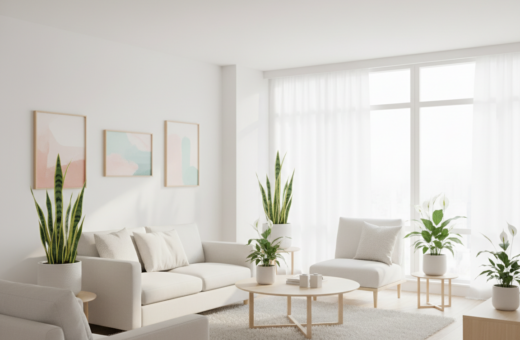
Using Light and Off-White Tones to Reflect Natural Light
Choosing luminous neutrals helps daylight travel farther and makes rooms read as more open. Soft off-white tones work best when they have the right undertones for each orientation and fixture type.
Choosing the right undertones
Undertones matter. A warm undertone can cozy a north-facing room, while cooler undertones pair better with strong southern exposure. They determine whether a shade reads creamy, pinkish, or slightly gray.
Benjamin Moore’s peel & stick paint samples make this easy. They let designers and homeowners move tests from wall to wall to watch how natural light shifts a hue across the day.
- Use off-white tones from Benjamin Moore to reflect natural light and brighten a small space.
- Paint the ceiling a shade lighter than the walls to visually heighten the room and lift sightlines.
- Test paint colors on different walls to see true reaction to day and evening light.
By choosing complementary tones and checking undertones in situ, they can create seamless transitions between spaces. This technique keeps sightlines intact and helps the whole home feel cohesive.
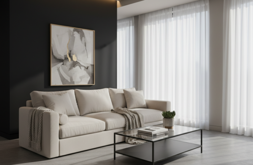
Creating Depth with Moody and Rich Hues
Using a bold, chocolaty tone introduces depth without cluttering sightlines. Benjamin Moore’s Wenge AF-180 is a deep chocolate hue that adds a moody, rich touch to compact bedrooms and cozy nooks.
Embracing darker paint can make a room feel curated rather than closed in. A designer may suggest applying the shade to one wall or an entire alcove to create a focal point and subtle drama.
Rich tones provide visual weight and a sense of enclosure that reads intentional. In a bedroom, the depth this hue brings can make the space feel like an intimate retreat.
- Use Wenge AF-180 on a single wall to anchor the room.
- Balance the dark tone with lighter textiles and reflective finishes.
- Let a skilled designer place accents so the depth feels deliberate, not overwhelming.
Incorporating Bold Contrast for Visual Interest
Bold contrasts help the eye map zones and turn a single room into purposeful areas. This approach uses opposing tones to guide sightlines and define function without adding physical barriers.
Two-tone schemes
A two-tone scheme pairs a dominant neutral with a vivid accent. In a compact kitchen, for example, homeowners might paint cabinets a saturated hue and keep the walls and ceiling neutral.
This method frames cabinets as a distinct zone and keeps sightlines open across the rest of the space.
Delineating multifunctional areas
Contrast can separate a home office from living or dining functions. Painting the trim or a single wall a different shade highlights architectural edges and makes zones legible.
- Living room & office: use contrasting accents to mark a desk area without crowding the room.
- Kitchen and dining: a two-tone wall and ceiling treatment adds polish and depth.
- Trim work: a different trim hue draws attention to moldings and windows.
Contrast is a simple, powerful tool that defines zones, enhances style, and keeps multiuse living organized and intentional.
Selecting Paint Colors for Petite Bathrooms
A pint-size bathroom is an ideal spot to try daring paint choices because the door closes and the commitment stays contained.
Bold shades can turn a modest powder room into an upbeat oasis for guests. A confident wall treatment makes the room feel finished and purposeful.
Even in spaces with limited natural light, the right shade improves the room feel. Reflective finishes and lighter trims help the tone read brighter and extend the perceived space feel.
Designers often recommend using a petite bathroom to test a paint color you might avoid elsewhere. If it reads well, the homeowner learns how that hue affects mood, light, and contrast before larger use.
- Focus on the wall to create a cohesive space feel that looks curated.
- Pair a saturated hue with crisp white trim to lift the ceiling visually.
- Use one bold shade; limit competing accents so the room remains calming.
A well-chosen paint color turns function into style. Even the smallest bathrooms can feel luxurious and intentional with the right approach.
Modern Approaches to Living Room Color Schemes
A modern living room benefits from a neutral backdrop that lets shapes and textures take center stage. Benjamin Moore’s Solitude AF-545 is an excellent paint color for this role, offering a calm wall that supports midcentury modern accents and artwork.
Subtle undertones are key. A paint color with restrained undertones helps the space feel cohesive and professionally designed. This approach makes furniture and lighting read as deliberate choices rather than competing elements.
Midcentury modern influences
Midcentury accents pop against a neutral surface. Designers often pair streamlined sofas and teak pieces with a Solitude backdrop to keep sightlines clean.
When selecting paint colors for a home office or bedroom, consider how natural light shifts the undertones across the day. Testing samples on the intended wall gives a true sense of how the paint will read in evening and midday light.
- Undertones matter: choose a paint color with the right undertones to unify living, office, and bedroom zones.
- Balance with accents: let furniture and art define the room while the wall remains a subtle stage.
- Designer tip: many professionals recommend Benjamin Moore paints to achieve a modern, timeless feel in small spaces.
Enhancing Hallways with Soft and Warm Shades
A softly painted hallway sets the tone for the whole home, turning a passage into an inviting connector. Applying a warm shade to the walls helps create a welcoming transition that makes adjacent rooms feel more coherent.
Benjamin Moore’s Subtle AF-310, Edgecomb Gray HC-173, and Lookout Point 1646 are ideal picks for narrow, dim corridors. These tones reflect light and add a gentle glow without overpowering adjoining spaces.
A light-reflecting paint color brightens a dim hallway and noticeably improves the room feel for anyone passing through. The result is a smoother flow and a stronger sense of space feel across the home.
- Welcoming transition: soft, warm shades on the wall make the home feel connected and more spacious.
- Brighter passage: reflective colors boost light and enhance room feel in dim corridors.
- Coordinated flow: pick a shade that complements the colors used in the rest of the home to unify the space feel.
For curated paint selections that work well in narrow zones, consult Benjamin Moore’s guide on paint choices for compact rooms. Thoughtful hallway treatments turn overlooked areas into purposeful parts of the home.
The Role of Texture in Small Space Design
Texture changes how a room feels the moment your hand meets the wall. It gives depth and warmth without stealing floor space.
Roman clay and plaster finishes create layered, tactile surfaces that read as luxury in modest rooms. Kamp Studios applied Portola Paints Roman Clay in Burrow to the walls of a petite parlor bathroom, proving neutrals can be rich and layered.
Roman clay applications
Roman clay yields soft, striated surfaces that reflect light unevenly. That variation adds perceived depth and keeps a neutral palette from feeling flat.
Plaster finishes
Plaster offers subtle tooling marks and a hand-crafted look that anchors a room. A skilled designer can use these finishes to elevate a bathroom or a kitchen into a high-end space.
- Elevated depth: textured finishes make the wall feel substantial and tactile.
- Designer impact: professionals like Kamp Studios use specialized techniques to refine modest interiors.
- Neutral richness: texture lets neutrals remain calm while staying visually interesting.
Incorporating Roman clay or plaster is a practical way to add character and depth to an interior without crowding sightlines. Many homeowners find that a unique finish turns a plain room into a memorable one.
Utilizing Monochromatic Palettes to Expand Boundaries
Wrapping a single tone from trim to ceiling quietly stretches boundaries and calms the eye. This approach removes the typical break between wall and ceiling so a room reads as one continuous surface.
Farrow & Ball’s Cromarty is an excellent example. Its fresh pastel with dirty undertones works when applied to walls, millwork, and the ceiling. The result is a seamless effect that helps make space feel larger.
Monochromatic schemes rely on subtle undertones to add depth. That nuance keeps the finish from appearing flat or boring. It also preserves perceived depth while minimizing distracting contrast.
- Extend sightlines: using the same shade on wall and ceiling reduces visual edges.
- Create cohesion: a single hue across a bedroom makes rooms feel boundless.
- Add sophistication: careful undertones provide layered depth without extra elements.
Designers favor this tactic for compact spaces because it simplifies the visual field. When walls and ceiling share one paint, the home reads as more unified and airy. The overall effect is a calmer, more open environment.
Strategic Use of Accent Walls for Architectural Interest
A single painted wall can shift how the eye reads a room and its architecture. Accent walls direct attention and make features feel deliberate rather than accidental.
Highlighting architectural details
Choose a vivid shade from trusted palettes to foreground trim, a unique ceiling, or built-in shelving. Benjamin Moore’s Santa Barbara Green 2037-60, City Scape Morning 368, and Trailing Vines 1505 are popular picks for this purpose.
Apply paint to one wall only to create a focal point without overwhelming the space. In a kitchen or powder room, a single wall treatment gives personality while keeping sightlines open.
- An accent wall painted in a bold shade can highlight ornate trim or unique ceiling features.
- In a bathroom or powder room, a strategic wall adds custom character and depth.
- Designers use a vibrant wall to guide the eye and manage visual flow across the room.
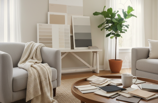
Testing Paint Samples Before Committing
Testing paint samples in situ prevents surprise shifts once a full wall is finished. He or she should view swatches on the actual surface and watch them across the day.
Benjamin Moore offers 8 oz. samples and peel & stick options that make this easy. Apply several small patches and live with them for a few days to see how natural light and fixtures alter the finish.
- Test paint colors on the intended wall to see true interaction with light and texture.
- Observe samples at different times of day to avoid an unhappy choice.
- A professional finish relies on judging how a paint color performs on your surface.
- Many homeowners find peel & stick samples from Benjamin Moore the most convenient route to confidence.
Taking time with samples reduces waste and helps ensure the final finish feels deliberate. This step is simple, but it pays off when a room reads cohesive and well judged.
Professional Tips for Achieving a Cohesive Home Flow
Consistent neutrals act like a visual thread that connects living areas and work zones.
Start with anchors. Benjamin Moore’s Chantilly Lace OC-65 and Revere Pewter HC-172 are reliable neutrals for linking hallways, the kitchen, and a home office.
Think about daily life. Professionals advise testing your choice across the day to see how light shifts undertones and affects mood.
- Use one neutral family to connect living, kitchen, and work areas.
- Keep trim and ceilings coordinated to avoid visual breaks.
- Place a single darker accent sparingly to define zones without fragmenting the flow.
- Consider texture and finish to add depth without extra things or clutter.
A simple, well-planned design strategy makes movement through a home feel larger and more intentional. Small decisions add up; choose wisely and live with samples before committing.
Conclusion
Selecting the right paint is the quickest way to transform a compact room into an inviting home.
Use light‑reflecting shades, a monochromatic approach, and a single accent wall to open sightlines and define zones. Texture and bold contrast add depth and personality without crowding the layout.
Always test samples on actual walls and check them at different times of day. That practice prevents surprises and helps confirm undertones and finish choices.
With professional guidance and high‑quality products, a thoughtful palette and finish strategy can make modest living feel cohesive, functional, and stylish.