Research into color psychology shows that specific soft hues can influence the nervous system and help residents feel more at ease at home.
Studies and professional interior painting teams note that reducing visual stimulation with a subdued palette can lower heart rates and ease tension. This effect ties into basic biology: the way people perceive tone often triggers automatic emotional responses.
Homeowners often want living areas that feel restorative and peaceful. By learning the science behind gentle tones, individuals make informed painting and design choices that turn a house into a personal retreat.
Understanding these principles helps owners and professionals select hues that support mental well-being and create a lasting sense of balance in everyday spaces.
The Science of Color Psychology in Your Home
Evidence from color studies links the hues around us to measurable changes in stress and alertness. Brighter tones can raise arousal and sometimes increase feelings of anxiety in residential settings.
Looking at blue, for example, is tied to the release of body chemicals that lower tension and support rest. This is why designers favor soft blue shades for some rooms.
The visual environment directly influences how the nervous system unwinds after a long day. When choosing paint colors for a home, the goal is to balance stimulation and comfort.
“The right palette can transform daily interaction with a space.”
Practical guidance helps homeowners pick tones that soothe the mind without creating dullness. For a deeper look at how hue choices affect well‑being, visit color psychology for home.
- Design relies on subconscious reactions to visual stimuli in living rooms.
- Choose shades that avoid over‑stimulation so rooms feel welcoming.
- Professional guides show how paint colors change daily moods.
Selecting Calming Apartment Colors for Every Room
Room-specific shades influence daily routines—sleep, conversation, and self-care. The right paint choice ties function to feeling and helps each space behave as intended.
Bedrooms and Sleep
For a restful bedroom, designers often recommend Benjamin Moore Blue Echo. This soft blue supports sleep and lowers visual tension at night.
Living Areas for Socializing
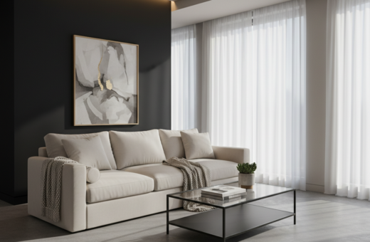
A living room benefits from a balanced palette that welcomes guests without overstimulating the mind. Soft pinks, muted grays, or gentle greens work well as a backdrop for conversation.
Spa-Inspired Bathrooms
Choose paint after fixtures are installed so the shade harmonizes with tile and hardware. A soft yellow or a green undertone can add warmth and a sense of renewal.
“Test paint during the day to see how light and undertones shift.”
- Consider how natural light hits walls in each room.
- Use Benjamin Moore and Sherwin‑Williams samples to compare shades.
- Test the paint in place; one sample can look different from another.
For practical steps on testing, see this short guide to test paint in your space.
Harnessing the Soothing Power of Blue Hues
Muted blues often work like a visual exhale, helping people relax when they enter a space. Designers recommend blue in bedrooms because it soothes a busy mind and supports rest.
Water’s Edge by Benjamin Moore is a leading example. This blue hue carries a gray, dusty undertone that reduces visual sharpness and prevents a room from feeling clinical.
The Impact of Dusty Undertones
Dusty undertones mute intensity and add warmth. In bedrooms, soft blue shades make it easier to unwind after long days of work.
- Water’s Edge by Benjamin Moore offers a soothing gray undertone suitable for many rooms.
- Blue-green hues bring similar restorative effects while adding subtle variety to the home.
- Designers on this blog often pair blue with gentle greens or warm gray tones to deepen the tranquil effect.
“A muted blue with dusty undertones reduces stark contrast and helps create a restful bedroom environment.”
Earthy Neutrals and Warm Tones for Balance
A well-chosen neutral palette can steady the eye and give a living space a grounded, inviting feel. Benjamin Moore White Dove is a go-to neutral paint color because it works in almost any light and creates a warm, luminous backdrop for a room.
Putty is another timeless selection. It adds gentle warmth without feeling pastel or overly hot. These neutral tones let furnishings and art take center stage while supporting a restful sense throughout the home.
A warm yellow hue can mimic candlelight and soften the mood in a living room or bedroom. Designers often pair that yellow with Benjamin Moore neutrals to keep a consistent palette across spaces.
“The mind often finds comfort in warm, neutral tones; they remain a staple in professional interior design.”
- White Dove works well as a versatile backdrop in many rooms.
- Earthy putty tones create balance that feels soft and sophisticated.
- Neutral paint choices let other decor elements shine while calming the overall hue scheme.
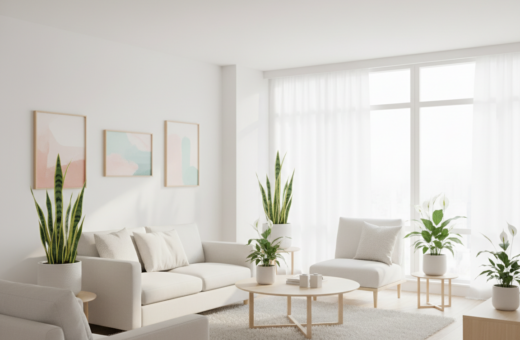
Incorporating Nature Inspired Greens and Grays
Subtle green hues, balanced with the right gray, create a restorative backdrop for everyday living. This palette brings a sense of the outdoors into a home while keeping the look sophisticated.
Restorative Green Shades
Nature-inspired greens work well in a bedroom or bathroom because they evoke foliage without overwhelming the eye. Designers favor soft, muted greens to foster a steady, restful mood.
Use green paint in low-sheen finishes to enhance a sense of depth. Pair greens with warm wood or pale textiles to keep the palette grounded.
Choosing the Right Gray Undertone
Gray undertones determine whether a shade reads warm or cool under different light. Benjamin Moore Stonington Gray is a soft, soothing gray that adds depth to a living space.
- Farrow & Ball French Gray is versatile enough for cozy bedrooms and formal dining rooms.
- Consider natural light and undertones before committing to a paint color.
- Pairing greens and soft grays creates a refined palette that supports long-term relaxation.
“The right gray undertone can transform a space, making it feel more cohesive.”
Soft Pastels for a Gentle Atmosphere
Choosing muted pastel tones can quietly change how a person experiences a space. Soft pastel pink, for example, is a surprisingly soothing shade that works well in a bedroom or nursery.
Designers often recommend light yellow to produce a gentle glow that feels like warm morning light. That yellow hue adds cheer without demanding attention.
Using soft pastel colors helps maintain a light, airy feel. These paint colors support relaxation and keep interiors from feeling heavy.
“A gentle pastel palette is an excellent choice for avoiding the over‑stimulation caused by brighter shades.”
Practical benefits include easy pairing with textiles and natural wood. Pastel colors let furnishings take center stage while keeping rooms welcoming for everyone.
- Pink pastels soothe a bedroom or nursery space.
- Light yellow mimics warm, soft sunlight.
- Soft hues reduce visual noise and support rest.
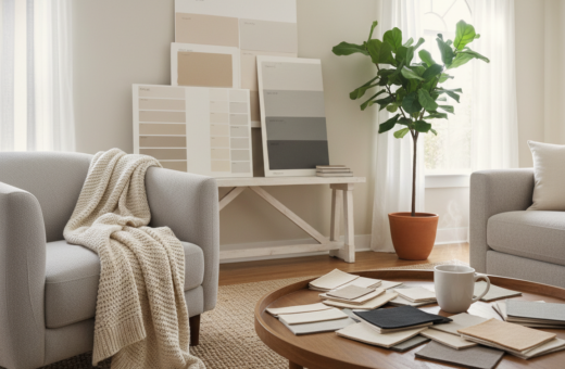
Practical Tips for Testing Paint in Your Space
A sample on your wall often tells a different story than a swatch under store lighting.
Before committing to a paint, test at least three small samples on separate walls. This shows how color shifts with the room’s light and how each wall reacts.
Order physical paint chips from Benjamin Moore and hold them against the wall at various times of day. Natural light and artificial light will reveal undertones that a photo cannot.
“Benjamin Moore OC-23 Classic Gray works as a steady backdrop for many schemes.”
- Apply sample patches, not just peel-and-stick chips, so you see true paint finish on the wall.
- Test the chosen shade in morning and evening light to confirm it keeps a calming paint effect.
- Use physical paint chips to compare several colors and avoid surprises after a full coat.
- Remember: the right gray undertone can change how rooms feel throughout the day.
Final step: live with the samples for a week. That one simple habit reduces costly mistakes and supports confident design choices for your home.
Conclusion
Small shifts in shade can reshape how one uses every space in the home.
By prioritizing soft blues and restorative greens, a homeowner can create a calming bedroom or a welcoming living room that supports a peaceful mind.
Consider how light falls on your walls and test paint colors in place. One well‑chosen shade helps rooms and bedrooms feel cohesive while letting furnishings stand out.
Investing time to compare shades and greens pays off. The design world offers many nature‑inspired options that make a house feel like a lasting sanctuary.