Emily Henderson often says selecting the right white is a game-changer for creating dimension in a living space. Choosing the best white paint tone apartment hinges on how light plays across walls and moldings.
They should first observe natural light at different times of day. Sunlight can reveal subtle undertones that shift from warm to cool. This changes how furniture and flooring appear.
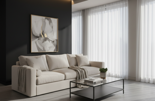
Using a warm white can stop a room from feeling clinical, especially in north-facing rooms. Designers note that the right tone creates a calm, cohesive atmosphere in modern homes.
The key is balancing light reflection and color absorption. With that balance, they can achieve a professional, inviting finish that feels both lived-in and refined.
Understanding the Impact of White Paint
Understanding how subtle undertones shift under different light is the first step toward a considered interior choice.
Transcendent and timeless, white and off-white paint colors give unmatched versatility in modern interior design. They act like a neutral fabric that changes with light, furniture, and architectural details.
Choosing the right white paint color is challenging because underlying tonalities and ambient reflections alter perception. Experts advise treating white paint colors as a true color, not a blank backdrop.
Quality matters. A higher-grade paint reflects light more evenly and shows fewer flaws. That effect changes how a particular shade white reads across walls and trim.
- Consider how each white interacts with wood, metal, and textiles.
- Evaluate samples on the wall, not a chip in your hand.
- Judge each white paint on its own merits, rather than by comparison.
Evaluating Natural Light in Your Apartment
How sunlight moves through a room largely determines how a chosen color will look. Inspecting light at different times gives a clear sense of how walls and trim will read in day and evening.
North-Facing vs. South-Facing Rooms
North-facing rooms often feel cooler because incoming light leans blue. Deirdre McGettrick, CEO of ufurnish.com, notes that these rooms appear cooler, while south-facing rooms receive more warmth.
Tip: North-facing spaces may benefit from a warm white to offset the cool cast and make living areas feel inviting.
The Effect of Artificial Lighting
Artificial lighting changes how white paint appears after sunset. Test samples under evening bulbs and daylight to see real differences.
- Visit a paint store with photos of your room and note how undertones react.
- Consider the mix of task and ambient lighting in the living space.
- Remember that windows, fixtures, and finishes all influence perceived color.
How to Find the Best White Paint Tone Apartment
A full wall sample reveals how light, furniture, and trim interact with a hue across hours.
They should avoid getting hung up on a name. As Donald Kaufman advises, the label matters less than how the color behaves in the specific interior.
Test large swatches in several spots near windows and near fixtures. Bring a small piece of fabric or wood to see how paint colors pair with finishes in the living area.
Benjamin Moore offers many options, but the final choice should respond to the room’s lighting and furnishings. A high-quality white paint will read consistently on both walls and trim.
- Try a full-size sample, not just a chip from the store.
- Watch how undertones shift at morning, noon, and night.
- Use a large sample before committing to a gallon.
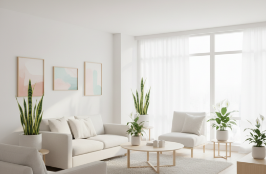
The Role of Furniture and Decor
Soft furnishings and wood finishes often decide whether a room feels warm or cool.
Deirdre McGettrick notes that the color of wood, fabrics, and soft furnishings will influence which white reads best in a space.
Coordinating Wood and Fabric Tones
Your furniture and soft furnishings play a critical role in how a neutral wall color reads. Dark woods absorb light and make a wall appear lighter by contrast.
Conversely, pale woods and cool textiles can make the same wall feel more muted. They reflect light differently and change perceived warmth.
- Consider undertones in floors and rugs before choosing wall color.
- Match fabric textures to the room’s mood — plush fabrics add warmth; linen keeps it airy.
- Use a cohesive palette so furnishings and walls feel intentional, not accidental.
A lot of designers say decor can make a neutral surface look vibrant or soft. Coordinating these elements defines whether the living area reads modern, traditional, or eclectic.
Avoiding Common Undertone Mistakes
A careful eye for subtle undertones can save a room from feeling either dated or clinical.
Tracy McLaughlin warns that choosing whites with too much yellow or gray changes a space dramatically.
Too much gray can make a home feel cold and uninviting. Too much yellow can read old-fashioned and lack crispness.
When selecting a paint color for walls and trim, test samples at different times of day. Natural light will reveal hidden undertones.
- Test several shades white on large patches of wall, not just chips.
- Compare how the white paint on trim reads against your furnishings.
- Walk the room in morning and evening to watch shifts in color.
“Selecting whites with too much yellow or gray can make a room feel either dated or hospital-like.”
For more curated options and pairing tips, see this neutral paint guide. These simple checks help ensure the final selection feels professional, balanced, and right for the interior.
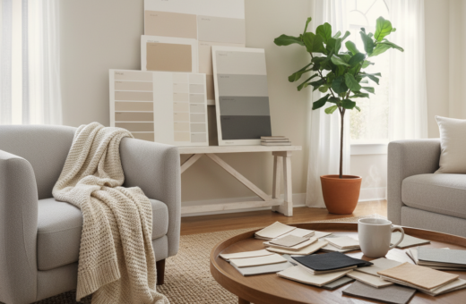
Why Professional Designers Use Large Samples
Designers often test large patches of color on walls to see how light and finishes interact.
Small chips lie. Fan decks from a paint store show a sliver of hue but they do not reveal how a shade plays with furniture, trim, and window light.
Why Fan Decks Fall Short
Fan decks lack scale. Tiny swatches hide undertones and fail to show shifts across different rooms and lighting.
Benefits of Repositionable Stickers
Samplize stickers use real paints on large, movable pieces. Emily Henderson calls them a game-changer for testing color in every room of the home.
- They stick and move without damaging walls.
- They show true undertones next to finishes and fabrics.
- They let designers compare how the hue reads near a window.
Testing at Different Times of Day
Donald Kaufman recommends painting a 3/8″ foam board with real paints and moving it around. Test in morning, noon, and evening.
“Using real paints on a sample board provides a more accurate representation than tiny chips.”
Comparing Popular White Paint Shades
They often begin by narrowing choices to trusted brands and placing large samples on several walls. Sherwin-Williams Pure White is widely used for a clean, versatile look that suits many living rooms.
Benjamin Moore remains a go-to for classics. White Dove has a creamy warmth that avoids yellowing. Chantilly Lace reads crisp and stays popular in professional projects.
For brighter rooms, Sherwin-Williams Extra White reflects light well and feels fresh under strong daylight. Farrow & Ball Pointing offers a warm, neutral option that pairs nicely with richer trims and furnishings.
- Sherwin-Williams Pure White — versatile and neutral.
- Benjamin Moore White Dove — soft, slightly warm without looking beige.
- Chantilly Lace — crisp and elegant in most interiors.
- Farrow & Ball Pointing — warm neutral with refined depth.
When comparing these shades, remember that benjamin moore and Sherwin-Williams deliver distinct undertones. Test samples near trim and in photos taken at different times to confirm how each paint color will read in your home.
The Importance of Sheen and Finish
Sheen changes how a hue reads more than most realize, shifting reflection and depth across a single wall.
Finish affects glare, depth, and how a color pairs with furnishings and trim. A shade may read warm and soft in eggshell but appear brighter in satin. Another hue can sparkle in semi-gloss and look flat in matte.
Matching Sheen to Room Function
Durability matters. High-traffic rooms need washable finishes. Semi-gloss or satin holds up better on walls and around a window or door frame.
Benjamin Moore and similar brands offer finishes that either hide flaws or highlight texture. Test samples of white paint and various paint colors under your room lighting before deciding.
- Use flatter sheens for ceilings and low-touch walls.
- Choose satin or semi-gloss near trim and on doors for easy cleaning.
- Consider how lighting and furnishings will interact with the finish.
“Always test your chosen finish in the actual room at different times of day.”
Creating Consistency Across Your Living Space
Carrying one neutral hue from room to room creates a calm flow that highlights furnishings.
Tracy McLaughlin recommends using the same shade on walls, trim, and moldings to achieve a fresh, cohesive look.
Many designers pick a single, versatile option such as Simply White to carry through a home. Doing so makes transitions smooth and reduces visual clutter.
When choosing a paint color for the living room, they should imagine how it reads in adjacent spaces at different times of day.
- Consistent paint choices help unify varying furnishings and finishes.
- Benjamin Moore colors are commonly used to keep an interior palette intentional.
- Testing samples across rooms reveals subtle undertones that affect flow.
“Painting every room the same white can make a space feel newly built and calm.”
Conclusion
In short, testing samples under the home’s actual fixtures and windows is the only sure way to know the result.
Consider natural light, room orientation, and subtle undertones when evaluating choices. Use large, repositionable samples to see how a hue reads next to furniture and trim.
Keep a single, high-quality option through connected rooms for calm flow. Avoid extremes that skew too gray or too yellow so spaces feel warm and inviting.
With these expert steps, they can confidently select a color that transforms their living spaces into a timeless retreat.