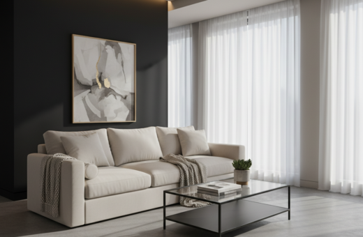
Designer Chad Dorsey used a cream palette in one living room to avoid a flat look. He layered feathery prints and varied pile heights on a Rug Company rug so the space read as curated, not empty.
The trick was thoughtful design that balanced the walls, furniture and art. A well-placed sofa and coffee table made the room feel like a warm sanctuary each day.
Across homes, rooms that felt high-end shared one quality: careful use of texture and contemporary silhouettes. Light and shadow were used to add depth so even pared-back neutral living schemes avoided any flatness.
When furniture, rug and walls work together, the living area reads as intentional. That single shift turns a simple space into a layered, inviting room in the home.
The Psychology of Neutral Spaces
Subdued colors quietly influence mood and perception in living spaces. A thoughtful palette does more than look calm; it reduces visual noise and helps people relax. Designer Eva Bradley proved this in a San Francisco Victorian by layering a spectrum of taupe tones across floors, walls, and textiles.
The Appeal of Subdued Palettes
A muted scheme encourages daily living to feel restful. Research and practice show that less saturated tones lower stress and invite conversation.
- Versatile canvas: homeowners can add unique furniture or art without clashing.
- Timeless quality: a restrained palette keeps rooms feeling current across years.
- Designer control: mixing taupe and warm tones creates depth without bright accents.
Avoiding the Flat Look
To keep a room from feeling flat, vary contrast between the walls and the sofa. Small shifts in tone and texture make the space read as layered rather than one-note.
Understanding how different neutrals interact enables a sophisticated scheme that works for both modern and classic living rooms.
Essential Luxury Neutral Interior Ideas
Warm metals and heirloom wood shifted a beige room from quiet to confidently composed.
Redd Kaihoi used bronze, brass, and gilt wood to lift an Upper East Side apartment. These materials warmed a classic beige palette and gave the scheme a distinct personality.
Choosing the right shades of cream and taupe makes rooms feel cohesive and inviting. When metallics sit side by side with soft fabrics, the result reads as layered and intentional rather than flat.
Key approaches include:
- Mixing bronze and brass accents with gilt wood to add depth and warmth.
- Balancing plush textiles and smooth surfaces for tactile contrast.
- Selecting wood tones and finishes that complement the palette without competing.
The focus is on materiality: every surface, trim, and textile contributes to a refined style. Applied thoughtfully, these methods make neutral living rooms feel maximal in character while staying restrained in color.
Mastering the Art of Layering Textures
Layering textures turns a simple living room into a tactile, memorable space. Thoughtful mixing of materials adds depth so the area reads as curated and warm.
Mixing Pile Heights
Vary pile on a rug to create visual movement underfoot. Short-loop weave pairs well with a feathery, high-pile accent rug for contrast.
Incorporating Linen and Velvet
Linen brings breathability; velvet adds plushness. Together they balance casual living with subtle richness.
The Importance of Fabric Weight
Heavier fabrics anchor furniture pieces like a sofa or coffee table skirt. Lighter linens soften seating and cushions for day-to-day comfort.
- Designer Suzanne Rheinstein focused on tactile quality to make her New York apartment feel bucolic and calm.
- A well-chosen coffee table grounds the room and showcases curated objects.
- Layering pile, fabric weight, and finish prevents a neutral living space from feeling flat.
Incorporating Metallic Accents for Depth
A carefully placed metal element changes how light and scale read across a room. Andre Herrero of Charlap Hyman & Herrero used stainless steel and warm beiges to create contrast in a California residence.
Stainless steel provides a crisp counterpoint to soft fabrics and wood. In one project, a mixed-material wall sculpture anchored the space and became the visual focus for the living room.
Designers often place metal finishes side by side with organic textiles and timber. That pairing adds depth to a simple neutral living scheme and prevents the room from feeling flat.
Metal surfaces also reflect daylight, which brightens corners and lifts shadowed areas. This reflective quality keeps the wall planes active and the overall scheme engaging.
- Select finishes that complement existing materials rather than compete with them.
- Use metallic accents in measured doses to maintain balance across the room.
- Consider sculptural pieces or thin trim to add modern punctuation without overloading the scheme.
For practical guidance on mixing metals and finishes, consult a specialist guide on decorating with metallic elements.
The Role of Architectural Features
Architectural details can instantly sharpen a living room and set the tone for the whole house. When designers treat structure as a deliberate element, the space reads as purposeful.
Highlighting Clean Lines
Alfredo Paredes used jet black Venetian plaster on a chimney breast in a Vermont alpine retreat. That bold paint choice turned the fireplace into a sculptural focal point for the entire room.
Emphasizing the wall plane and chimney geometry created a modern punctuation against the rustic landscape. The finish reads like an exclamation point that organizes sightlines.
“A dramatic architectural surface can anchor furniture and make every piece feel intentional.”
In plan, a well-defined layout lets seating, rugs, and art integrate without friction. The result is a living area where form and function work together.
- Bold finishes reinforce clean lines and clarify spatial hierarchy.
- The fireplace becomes both heat source and design statement.
- Architectural features supply a lasting framework that complements softer furnishings.
Selecting the Right Paint Finishes
A single, well-chosen paint color can unify a room and sharpen its character.
Moody charcoals or ash tones raise perceived value in many living rooms. Jeremiah Brent applied an ash color across the walls, ceiling, and window treatments in his New York office lounge to create a cohesive scheme.
The finish matters. A matte surface soaks up light and softens shadows. A glossier finish bounces light and highlights detail.
Painting walls and ceiling in the same tone creates a cocoon-like space. That approach makes the room feel intimate and drawn together.
Velvet chairs work especially well against darker paint. The plush fabric adds tactile contrast that balances simple architectural planes.
“Using one color across planes can turn a sparse layout into a focused, intentional living area.”
- Choose finish by light: brighter rooms take matte well; dim rooms benefit from low sheen.
- Test samples: paint large swatches on walls and the ceiling to see shifts in real light.
- Pair texture and tone: soft fabrics and varied materials keep rooms from feeling flat.
Balancing Warm and Cool Undertones
When warm and cool hues meet, the living room gains layered depth and personality.
David Netto demonstrated this in a New York country house by mixing antique furniture from several eras with folksy fabrics. The result felt grounded and historically rich rather than staged.
A painted ceiling introduced a subtle new tone that tied the palette together. That small move connected walls, rugs, and upholstery so the various pieces read as one cohesive style.
- Balance: pair warm woods with cool textiles to avoid a flat look.
- Scale: let larger furniture anchor the room and add smaller accents for breath.
- Finish: matte and satin surfaces react differently to light—use both.
The right eye for detail keeps the home from feeling static. Thoughtful contrasts of warm and cool tones animate rooms and make living areas feel lived in, not uniform.
Utilizing Natural Stone Elements
Natural stone can anchor a living room and tie the décor back to the surrounding landscape. Using travertine and limestone makes a scheme feel rooted and tactile.
Travertine and Limestone Applications
Nicole Hollis used travertine, bleached oak, and limestone in an epic desert retreat to craft a cohesive home palette. The pared-back approach let material quality lead the design.
A stone fireplace became the focal point of the room, grounding the seating and lending permanence to the overall scheme. That single move gave the space a clear visual center.
- Natural stone brings the landscape into the living room while keeping the scheme restrained.
- Pairing stone with bleached wood helps the room feel connected to site and season.
- The texture of travertine and limestone adds visual interest that synthetic finishes cannot mimic.
- In a house aiming for an organic yet refined feel, stone creates a sophisticated base for furniture and art.
Applied judiciously, stone elements make a space both organic and modern, giving designers a reliable way to elevate a living room without heavy ornament.
Integrating Organic Shapes and Silhouettes
Soft, sinuous forms quietly rewrite how a living area reads, turning flat planes into a gentle choreography of shape.
Alyssa Kapito used a plaster chandelier by Eric Schmitt to introduce architecture and a warm glow to a New York home. That single fixture lifted the ceiling and made the whole space feel intentional.
Curved lines in the sofa and wall art soften sightlines and invite lingering. Rounded silhouettes break monotony so the room reads as calm and considered rather than static.
Designers can treat each piece as a silhouette. When chairs, tables, and lighting share a gentle profile, the walls and surfaces coordinate without clutter.
- Soft seating areas create an inviting oasis that feels measured.
- Well-placed fixtures draw the eye upward and define the area.
- Focusing on silhouette keeps the living plan curated and purposeful.
The Impact of Statement Lighting
Statement lighting can transform a living room from merely useful to strikingly sculptural. It supplies essential illumination and becomes an object that shapes the space.
In a Brooklyn flat by the Office of Tangible Space, designers used a lime wash to add subtle texture. The finish made the apartment feel compact and warm—like living in an acorn.
A well-chosen coffee table and rug arrangement reads differently under dramatic fixtures. Lighting can define the living area and tie furniture into a single composition.
Statement pieces often serve as the room’s jewelry, calling attention to the fireplace or an architectural plane. They guide the eye and set the mood for daily life.
- Mix heights: lamps, pendants, and low tables create a layered, human scale.
- Use focused light to show texture on walls and textiles.
- Let one bold fixture anchor a neutral living scheme while smaller lamps add warmth.
“Lighting acts like jewelry—small in scale but essential in effect.”
Curating Antique and Vintage Pieces
Adding vintage furniture gives a living room instant character and a story that modern pieces rarely supply.
Augusta Hoffman mixed contemporary silhouettes with weightier wood antiques to keep a room bright and layered despite darker tones. The result felt like a collected home rather than a showroom.
Every piece matters: a coffee table or side chair should support the room’s wider art and plan. Thoughtful placement keeps circulation clear and the design cohesive.
Curating means choosing pieces that speak to each other. Balance the heft of old wood with sleeker furniture so the space reads as intentional and lived in.
Vintage items add a narrative. Over time, the mix evolves day by day, making rooms feel timeless and personal rather than momentary.
- Select one anchor antique, like a wood table, then add smaller modern accents.
- Use art and textiles to bridge tones and eras.
- Let a single designer piece punctuate the collection.
Playing with Monochromatic Ombré Effects
An ombré wall treatment can read like a horizon, stretching a small space visually. Rodney Lawrence specified a sunriselike gradient wallpaper for a Manhattan model apartment to make the scheme feel modern and restful.
Playing with monochromatic ombré shades on a wall or ceiling draws the eye across the living area and makes the room feel larger. The fade creates movement without adding pattern, so the palette stays calm and cohesive.
A well-placed rug can be part of the ombré strategy. It anchors seating while echoing the same tones, reinforcing the chosen palette and tying floor to wall.
- Soothe a space: a gradual color shift sets a relaxed mood in a neutral living scheme.
- Expand perception: vertical or horizontal fades lengthen sightlines and raise the ceiling.
- Unify surfaces: matching rug and wall tones makes the room read as intentional.
When done carefully, a monochromatic ombré becomes the quiet hero of a living room.
Introducing Subtle Patterns and Motifs
Subtle patterns can give a living room a quiet signature without overwhelming the scheme. Small motifs change the look while keeping calm and cohesion.
Designer Kristen Buckingham achieved a fresh, youthful result at Reese Witherspoon’s Ojai ranch by using linen slip covers and a white-washed paint treatment. The approach kept the palette light while allowing fine patterning to read as deliberate, not busy.
The house benefits from a careful mix of leather and wood furnishings that balance patterned fabrics. Faint stripes, tiny geometrics, or tone-on-tone florals on chairs and cushions add texture without loud contrast.
Focus seating on subtly patterned pieces so the living area feels curated and welcoming. A cohesive plan ensures each motif echoes elsewhere—on a rug, a pillow, or a lampshade—so the home reads as intentional.
- Keep motifs small: they complement, not compete.
- Anchor with solids: leather or wood gives tactile contrast.
- Learn more: see decorating with neutrals for guidance on subtle pattern play.
Creating Focal Points with Bold Contrast
Bold contrast gives a room an obvious place to rest the eye and a story to tell.
Architect Paul Lamb used adobe walls in an Austin ranch house to set a warm, sculptural backdrop. Modern sofa and chair pieces read sharper against that rough plane, so the living room reads as deliberate rather than flat.
A dramatic fireplace or a single unique piece of furniture can anchor the entire scheme. By introducing contrast, the beauty of a calm palette becomes more visible and the space feels dynamic and composed.
- Choose one anchor: a bold wall, fireplace, or chair that draws focus.
- Scale with care: let the anchor relate to the rug and coffee table so sightlines are clear.
- Limit extras: a few well-placed pieces keep the plan cohesive and intentional.
Every living space benefits from one clear focal point. When a designer defines that center, the home reads organized and the pieces around it gain purpose.
Embracing Nature-Inspired Color Palettes
Drawing color from the land outside the window makes a living room feel rooted and lived in.
Designers often study the surrounding landscape to choose a palette that extends the house into the garden and beyond. Ken Fulk, for example, installed a 19th‑century stone mantel imported from Italy in a Sonoma estate to give a new build an old‑world sensibility.
Simple materials—weathered wood, hand‑worn textiles, and a few vintage chairs—anchor the scheme. These elements create a lasting style that reads calm and tactile rather than staged.
A well‑chosen coffee table and matching tables support the theme while serving daily use. Select a low, honest piece in wood or stone to reinforce the natural materials and to tie seating to the floor plane.
Paint and fabric decisions should mirror the site: the gray of river stones, the warm tan of oak, or the muted green of nearby pines. Doing so ensures the living space keeps a clear look that feels like a true extension of the home.
- Site-led palette: choose tones from the immediate landscape.
- Material mix: pair stone, wood, and vintage pieces for depth.
- Functional accents: use coffee and side tables to complete the theme.
Conclusion
A well-composed living room balances texture, light, and proportion so the space feels both calm and considered.
Achieving that balance means thinking of the room as a single scheme. A statement fireplace, layered tones, and varied materials work together to add depth and elegance.
These moves ensure the home reads as welcoming every day. Whether the chosen style leans modern or traditional, the plan should let each piece play its part.
In short, small, thoughtful choices turn a simple space into a memorable living room that feels lived in and intentionally made.