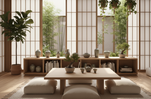
Studio Prineas shows how a careful selection of art, books, and objects brings calm to any space. Photography by Chris Warnes and styling by Jack Milenkovic highlight a clear approach that balances texture, color, and scale.
One small piece can change the whole look. The B56 Small Ceramic Vase ($64) is an example of how a single vase adds beauty without clutter. The Xavier 12.5″ Portable Table Lamp ($38.80) offers a cord-free way to add light to a bookshelf.
A calm home starts with intention. Curating shelves means choosing pieces with care so the space feels organized and not crowded. This course of action helps maintain balance while letting art and decor stand out.
These tips focus on simple adjustments that make shelves feel cohesive. They turn storage into a considered display that supports a peaceful, refined aesthetic for the home.
Preparing Your Space for a Minimalist Refresh
Begin with a clean slate: remove all items so the space can be assessed anew. Emptying the shelves gives a clear view of scale, color, and what truly belongs in the room.
Clearing the shelves
Nathalie Martin of the Woahstyle blog stresses that the first step is to clear the room of clutter. Taking everything off the shelf helps spot pieces that are worn, irrelevant, or duplicated.
Sort things into “yes” and “no” piles. The goal is to keep only the items that fit your new style and complement your color scheme. A before photo of the bookshelf often gives the push needed to start editing.
Creating a mood board
Next, make a mood board—Pinterest works well for this step. Collect photos and posts that show the living room look you want.
This exercise clarifies the goal for decor and helps choose pieces that belong. When edits are guided by a clear mood board, the shelf becomes a considered display rather than a catchall.
Essential Minimal Shelf Styling Ideas for a Calm Home
A calm-looking shelf begins with a clear plan for color, shape, and scale. Emily Henderson of EHD advises that a consistent color palette is one of the ground rules for a successful display. When the palette is set, the room reads as cohesive and restful.
New York firm Chango, led by Sarah Elliott, shows how wood paneling warms a study. Adding warm wood prevents a stark look and gives the space a lived-in feel.
Balance comes from contrast and repetition. Mix tall books with low objects, repeat a color in three spots, and tuck in a small plant. Greenery brings life and a hint of color without overpowering the shelf.
- Discipline your palette: limit hues to two or three for a calm look.
- Vary form: combine round vases, stacked books, and framed art for depth.
- Use photos as examples: each image in this post shows how art and books create a collected, professional aesthetic.
These tips make the bookshelf work for the living room and the home at large. Following this course of action helps the eye move across the display and keeps the space organized.
The Importance of Negative Space in Design
The art of leaving space can make a single object feel intentional and important. Connie Vernich of Vernich Interiors notes that negative space lets an object become centerstage and gives a room calm, collected energy.
Defining the solid to void ratio
Solid to void is a simple design rule that sets the amount of filled area versus empty area on a shelf. When this ratio is clear, a bookshelf no longer looks like a cluttered mess.
Vernich recommends grouping like items—antique boxes, for example—so they tell a stronger story than scattered pieces. A single, well-placed object often has more impact than many small photos or random decor.
- Negative space is the area around and between objects, crucial for balance.
- Define the solid to void ratio to stop a bookshelf from looking overfilled.
- A desaturated family photo (as in the Marble Crafter Venus Marble Frame) can match a calm color palette.
- Giving favorite decor room to breathe improves the overall aesthetic of the room.
By planning how shelves are spaced, the eye can rest and each object earns attention. This simple restraint creates a stronger, more peaceful design and lasting balance.
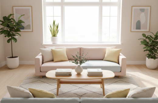
Curating a Cohesive Color Palette
A carefully chosen palette ties decor together and calms the whole room.
Ginger Curtis of Urbanology Designs recommends limiting the color palette to keep a cohesive look across a living space. Neutral tones form a quiet base. Then add muted pops—soft shades like baby pink—to bring gentle interest without overwhelming the room.
This approach makes each object feel intentional. When the color of decor items complements the broader design, the shelf reads as part of the room, not a distraction.
“Stick to a few related tones and let texture do the rest.”
- Limit hues to two or three for a unified look.
- Consider interaction between an item’s color and the room’s finishes.
- Use muted accents to add measured beauty and depth.
For practical guidance and visual examples, see these palette tips that show how a coordinated approach elevates the overall design.
Selecting Quality Pieces Over Quantity
Choosing fewer, better objects makes a display feel intentional and refined.
Ginger Curtis of Urbanology Designs says the primary goal is to pick high-quality items that carry weight within a room. Quality pieces add texture and color without overwhelming the space.
A single statement piece—like a well-crafted vase or sculpture—anchors the composition more effectively than many small, similar items. That focal point brings a professional edge to books and decor.
Layering matters. Place smaller objects in front of larger ones to create depth. This approach gives the arrangement dimension and helps the eye move through the design.
- Prioritize durable, well-made pieces that reflect your style.
- Let one statement object act as the visual anchor.
- Use layering to add depth with books, frames, and a few chosen objects.
Quality over quantity keeps a bookshelf refined and purposeful. When every piece earns its spot, the entire space reads as a considered, lasting design statement.
Incorporating Texture and Form for Visual Interest
Texture and shape give shelves personality and help a room feel curated rather than crowded.
Eva-Marie Prineas of Studio Prineas recommends mixing materials like wood, ceramic, and greenery to add depth to a display. A rough wooden box paired with a smooth vase creates contrast that is pleasing to the eye.
Mixing materials
Vary opacity and surface—matte ceramics, glossy glass, and woven fibers each catch light differently. That variety prevents a shelf from looking monotonous.
Use one sculptural object as an anchor. A unique vase or bowl breaks up rows of books and draws attention to form as well as color.
Adding greenery
Plants introduce organic texture and scale. A trailing plant softens edges while a compact succulent adds a geometric note.
The solid to void ratio remains important. Leave breathing room around a plant or vase so each object gains emphasis and the space reads as balanced.
- Mix wood, ceramic, and greenery for layered texture.
- Add a vase or plant to warm up the decor.
- Vary shapes to create a lot of visual interest across the space.
For more layered examples and real-room photos, see curated tips on shelf composition.
Techniques for Layering Art and Books
Stacked volumes and leaned artwork turn plain shelving into a composed vignette. These techniques add depth, texture, and a casual order that feels deliberate rather than cluttered.
Stacking books horizontally
Stack books in short piles to create a base for small objects. Place a lidded bowl, family heirloom, or a compact vase on top to create a focal point.
Emily Henderson recommends this step as a simple way to anchor a group and add height without crowding the shelf.
Leaning art pieces
Lean framed prints against the back of the shelf to make the space appear deeper. Layering one piece in front of another adds dimension and a relaxed, lived-in feel.
“Layering art in front of other art is a great technique to add depth to your shelf.”
Grouping similar objects
Group like-colored vessels or candleholders to create a sense of order and personality. Nathalie Martin and other stylists use matched pieces to tie a room together.
- Use three similar objects for balance and rhythm.
- Add one statement object, such as a teak and resin bowl, to introduce texture.
- Rotate photos and small decor seasonally to keep the bookshelf fresh.
For practical examples and more bookshelf tips see bookshelf tips.
Maintaining Order Through Regular Editing
Small, scheduled edits protect the calm look of a room over time. Ginger Curtis of Urbanology Designs recommends periodic reassessment to remove items that no longer fit the plan.
Make a habit of checking your shelves every few months. Remove things that feel outdated or no longer bring joy. This keeps each shelf intentional and prevents it from becoming a dumping ground.
Negative space is a key tool. Leaving air around a few objects helps the color and form of each piece read clearly. When fewer items remain, the entire space feels lighter.
- Commit to regular editing so order becomes routine.
- Use stylish storage boxes to hide small things and preserve a clean look.
- Let the bookshelf reflect current tastes—editing keeps decor aligned with life.
Ultimately, the goal is simple: every item should serve a purpose or spark joy. Regular curation maintains balance and a peaceful, orderly home.
Conclusion
A few careful choices can turn an ordinary shelf into a calm display that feels purposeful and refined.
Follow the steps here to shape a restful space with clear color, considered scale, and room to breathe. Thoughtful selection of decor and balanced negative space brings lasting beauty to any home.
Put the guide into practice by editing regularly and letting one statement piece anchor each run of books or objects. These tips and ideas form a simple step-by-step path to a cleaner design.
Thank you for reading this post. With small edits and clear intent, anyone can create a curated display that reflects personal taste and calm order.