This guide opens with a clear goal: to stop common errors that turn clean interiors into clinical rooms. It looks at practical fixes for anyone pursuing warm minimalist apartment ideas while keeping a refined finish.
Many people confuse minimalism with emptiness. They strip layers until a space loses personality. This text explains how subtle choices in design and texture revive a home without clutter.
By embracing the core tenets of warm minimalism, a living area becomes both calm and inviting. Small shifts in color, fabric, and lighting help the interior feel lived in and personal.
Readers will learn practical steps to shape a functional, stylish room. This professional guide helps them move from cold, clinical setups to inviting, usable rooms that match daily life.
Understanding the Philosophy of Warm Minimalism
Warm minimalism builds on a century of design thought to marry restraint with human comfort.
Rooted in the Bauhaus era, this style shifts focus from purely formal experiments to human-centric function. It values materiality and texture so the space feels lived in, not staged.
Intentional curation guides every choice. Each item earns its place by serving a clear purpose while adding to the visual harmony of the room.
“Simplicity is not about removing life from a space, but about making room for what matters.”
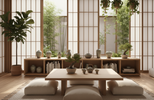
Designers borrow restraint from Japanese traditions to balance form and comfort. Natural materials inject quiet warmth, and simple palettes let texture become the focal point.
- Human-first function over cold ornamentation
- Beauty through careful selection, not excess
- Simplicity that supports daily life and calm
Why Minimalist Interiors Often Feel Cold
A stripped-back interior can feel inhospitable when essential sensory cues are removed. People expect minimalism to calm them, but a lack of tactile and visual warmth makes a room read as distant.
Stark whites and severe contrast can sharpen lines, but they also erase the subtle shifts the eye needs to rest. When the palette relies on high contrast alone, surfaces look flat and the space loses comfort.
The Impact of Stark Whites
Overuse of pure white removes nuance from a scheme. It exaggerates shadow and makes natural light feel clinical rather than cozy.
- Problem: White + high contrast emphasizes geometry, not people.
- Fix: Add off-whites, soft beiges, or a linen throw to break harsh contrast.
The Problem with Synthetic Materials
Plastic, chrome, and glossy finishes often read as sterile. These materials disconnect a person from nature and reduce emotional warmth.
“Incorporating wood and linen can immediately soften hard lines and make a room feel lived in.”
- Introduce natural materials like wood and linen to balance clean lines.
- Layer varied textures so the eye has places to rest and the interior feels human.
For practical inspiration on blending restraint with comfort, see this warm minimalist approach to interior design.
Essential Warm Minimalist Apartment Ideas for Your Home
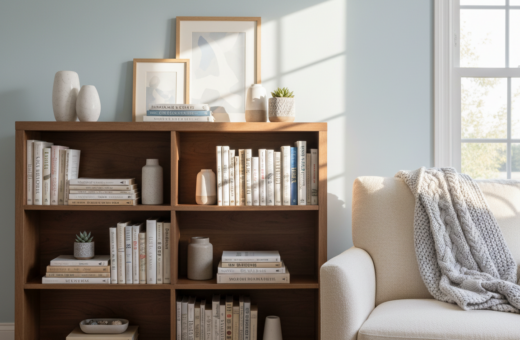
Thoughtful selection of furniture transforms a clean room into a comforting refuge. Choose fewer, well-made pieces that balance form and function. Each item should serve daily life while adding to the room’s visual calm.
Integrate natural materials like wood and stone to add texture and tangible warmth. These materials help a minimalist interior avoid feeling sterile by providing depth and subtle variation.
- Prioritize comfort: sofas and chairs with simple lines and supportive cushions.
- Quality over quantity: select durable pieces that age well.
- Material mix: layer wood, linen, and stone for tactile contrast.
- Functional beauty: storage that hides clutter without sacrificing style.
This guide recommends focusing on essential elements to keep the space uncluttered. The result is a home that reads as both stylish and livable.
Design choices should make a room feel like a sanctuary, not a showroom.
Selecting a Palette That Radiates Comfort
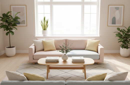
A considered palette gives a room emotional depth without adding clutter. Foundation colors should cover about 60–70% of the space. Use warm whites or soft creams to set a calm stage for the interior.
Reserve 20–30% of the room for mid-tone neutrals. These mid tones add depth and visual interest without creating harsh contrast. Think soft taupes, muted greys, or gentle sand tones for walls and larger pieces.
Testing Undertones in Your Space
Always test samples at different times of day. Natural light and artificial lighting shift color perception. A swatch that reads creamy at noon can look cool at dusk.
“Proper lighting and color selection work together to keep a minimalist space inviting.”
- Foundation: 60–70% warm neutrals for cohesion.
- Mid tones: 20–30% to add depth and interest.
- Accent tones: terracotta or sand in furniture and walls to ground the room.
The Role of Natural Materials in Softening Spaces
Layering linen and wood brings tactility that counteracts the sterility of strict minimalism.
Natural materials such as linen, cotton, and oak add immediate texture and depth to walls and furniture. These elements create a tactile field the eye can rest on.
Designers often combine grainy wood with woven textiles to build a layered look. Each layer contributes subtle variation in color and pattern without cluttering the room.
Using different materials across floors, upholstery, and small accents helps a space feel cohesive and grounded. The result is an interior that reads as intentional and lived in.
“Wood grain and woven textiles provide the necessary warmth to counteract cold minimalism.”
- Texture: mix linen throws, cotton rugs, and wood furniture for tactile contrast.
- Depth: vary finishes—raw timber next to soft fabrics—to add visual richness.
- Balance: prioritize materials that age well and require minimal ornament.
For practical examples of how natural materials shape a cohesive scheme, see this warm minimalist approach to interior design.
Balancing Clean Lines with Organic Shapes
Introducing organic shapes into a linear scheme invites the eye and soothes the body. This pairing keeps a room from feeling too formal while preserving the clarity of the design.
Mix and match purposefully: place a sleek, modern coffee table beside curved seating to create instant visual interest. The contrast between clean lines and soft forms defines the space without adding clutter.
Choose pieces that speak the same style language but vary in silhouette. A low wood sideboard with flowing edges adds warmth and a tactile counterpoint to sharper furniture.
“The interplay of straight geometry and organic curves makes a space feel lived-in and deliberate.”
- Use straight-lined shelving with rounded chairs to guide circulation.
- Balance large geometric pieces with a few sculptural accents for visual interest.
- Prioritize quality materials and varied textures to keep simplicity from feeling flat.
Strategic Texture Layering to Avoid Clutter
Texture, used with restraint, is the quickest route to a lived-in, calm space. Strategic layering adds depth while keeping the palette simple. The goal is a coherent room that reads as intentional, not busy.
Combining Textiles
Mix linen, cotton, and a heavier wool throw to vary touch and scale. Keep color tones close to the palette so layers blend.
Small, quality pieces such as a linen cushion or cotton rug add tactile contrast without visual clutter.
Architectural Textures
Introduce rough-hewn wood or subtle plaster on walls to provide material depth. These elements give a minimalist space substance while preserving clean lines.
Decorative Accents
Use a well-chosen coffee table as a focal point for simple accents. A ceramic bowl, a single book, or a wood tray creates visual interest and highlights the furniture.
“Thoughtful textures make design feel curated, not accidental.”
- Favor durable materials that age well.
- Use lighting to reveal grain and weave.
- Limit ornament to a few meaningful accents.
Choosing Art That Enhances Your Sanctuary
Artwork anchors a room, turning empty wall space into a personal statement. A well-chosen piece introduces color, texture, and contrast without cluttering the home.
Hang art at eye level. Aim for 57–60 inches from the floor to the center of the piece so the composition reads naturally with surrounding furniture.
Use the two-thirds rule above a table or sofa. The artwork should be roughly 2/3 to 3/4 the width of the furniture below to keep proportions balanced.
Choose pieces with organic tones and tactile surfaces—papers, canvas, or wood frames enhance the palette and add subtle texture to the interior.
Limit the number of art pieces. Fewer works preserve the simplicity of the design and let each item act as a meaningful focal point.
“Good art complements furniture and scale, then quietly defines a room’s aesthetic.”
- Select art that complements the room’s palette and overall style.
- Measure before you hang; obey the two-thirds rule for balance above a table or sofa.
- Prioritize texture and warm color tones to soften contrast and enrich the space.
- Limit pieces so each work can breathe and become a focal point in the home.
Lighting Techniques for a Cozy Atmosphere
Light layering brings out the grain of wood and the weave of linen, making a room feel alive.
Use warm-toned bulbs (2700–3000K) to create a relaxed and inviting atmosphere. These bulbs soften edges and add subtle warmth to natural materials in the room.
Avoid harsh overhead fixtures that flatten textures. Instead, layer ambient, task, and accent lighting to add depth and highlight key elements of the design.
Table lamps with linen shades produce a gentle glow that reveals texture without glare. Place them near seating and on side tables to emphasize clean lines of furniture while keeping comfort high.
“A well-lit room feels more spacious and welcoming; lighting is a critical component of successful minimalism.”
- Position floor lamps to wash walls and reveal material depth.
- Use adjustable task lights for reading and focused work.
- Add low, directed accent lights to draw interest to art or wood grain.
Lighting decisions shape the interior’s aesthetic. With careful placement and warm bulbs, a minimalist space becomes inviting while preserving clarity and style.
Creating Flow Across Different Rooms
Flow across a home comes from small, repeated choices rather than big statements. A consistent palette and similar wood tones link living and sleeping areas so the interior reads as one considered space.
Arrange furniture to define zones. An open plan layout aids movement and makes it simple to place a coffee table or side table as an anchor. Use those pieces to mark a seating area without closing circulation.
Use art and subtle wall treatments to guide the eye. A few related art pieces or a repeated tone on walls helps each room feel like a natural extension of the next.
Mind lighting in transitions. Even modest hallway lighting preserves mood and avoids abrupt shifts between spaces. Layered lighting keeps materials and wood grain visible as someone moves through the home.
- Edit belongings and keep surfaces clear to enhance flow.
- Repeat one or two materials across rooms for cohesion.
- Place key furniture deliberately to balance openness and function.
“Cohesion comes from restraint: consistent tones, repeated materials, and thoughtful lighting.”
Common Decorating Mistakes to Avoid
Small missteps in decoration often turn a calm scheme into visual clutter. A sparse room can feel cold when the wrong choices accumulate.
Over-decorating is the top error. Too many objects interrupt clean lines and reduce clarity. Edit down to purposeful decor and a single, well-placed table or tray to anchor a vignette.
Harsh, cool lighting also harms a scheme. It flattens texture and makes even quality furniture look uninviting. Layer light with lamps and dimmers to preserve mood and show materials like wood at their best.
Ignoring contrast or texture leaves a space flat. Balance the palette with subtle contrast and tactile materials to add visual interest without clutter.
Using many small art pieces creates noise. Choose one larger art piece or two related works to give walls breathing room and stronger impact.
Finally, scale matters. Wrong-sized furniture disrupts flow and comfort. Match pieces to the room’s proportions to keep movement easy and the style cohesive.
“Edit first, then embellish sparingly.”
Conclusion
Design that respects daily life turns a neat interior into a lasting refuge.
This guide shows how to transform a home by prioritizing beauty and functional comfort. Intentional selection of art, color, and decor keeps the scheme personal and cohesive.
Embracing simplicity lets a person focus on what matters. The result: a room that feels organized, peaceful, and inviting.
As they refine the space, minimal edits and thoughtful choices bring balance and lasting comfort. With these principles, anyone can create a home that stands the test of time and offers daily calm.